
 Medialab-Matadero Madrid
Visualizar'09: Public Data, Data in Public · Project Showcase
Desde 27/11/2009 12:11 hasta 17/01/2010 12:01
Hydro Status of Now
By Keyvan Minoukadeh and Katrin Caspar. Collaborators: Javier Tardáguila, Juan Galván, Felipe Gutiérrez, Marco A. Velasco, Guergana Tzatchkova, Inés Rodríguez, Eeva-Liisa Puhakka, Jamie Goodhill, Cesc Ballesté and Francesca Bardaro.
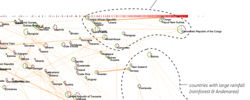
The original aim of the project was to explore issues related to water, especially water use and availability - "Where do we get our water from? How are we using it? And how much are we using?" We had no fixed path at the outset so we envisioned an open process where we could discuss ideas and find a path forward with interested collaborators.
We found campaigns trying to urge people to lower water usage to sustainable levels interesting and tried to find data to visualise the global situation. Data on sustainable use of water is lacking and difficult to calculate, and therefore hard to show in a visualisation.
Physical availability and use of water is easier to show but does not highlight the problems of access and real shortage people face in many countries. Nonetheless it is interesting data and we experimented with a few visualisations using this data.
> Find more information on the Wiki and http://hydrostatusofnow.org/
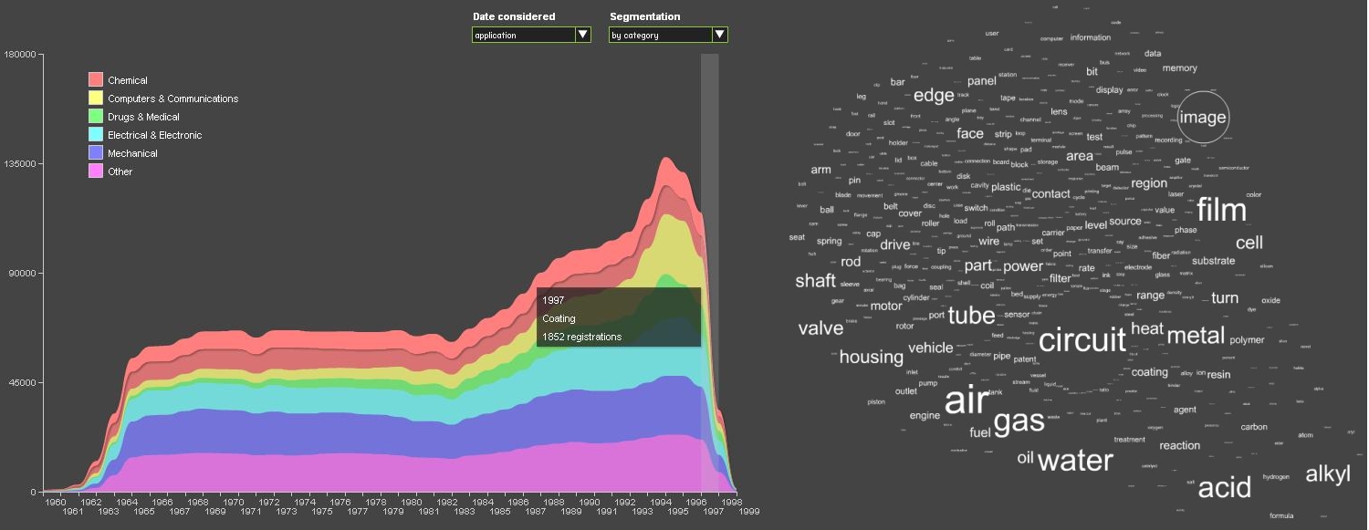
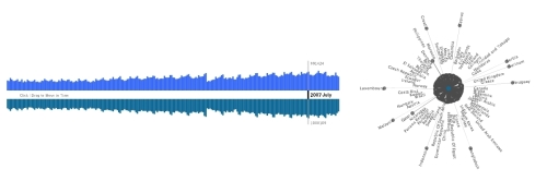
The evolution of innovation. A visual history of patent registrations during the last decades (La evolución de la innovación. Una historia visual de los registros de patente en las últimas década)
By Leonardo Solaas. Javier Tardáguila and Alberto Labarga.

The main objective of this project is to facilitate an exploration and understanding of the process of scientific and technical development in the world in recent decades. To do so, a detailed, accessible and homogeneous data collection is offered: US patent records, which document a fundamental aspect of technological innovation, not only in the US but also worldwide.
We use text analysis and citation relations among patents to identify trends and relations of influence by technological fields and periods. These analyses have taken shape in several interactive visualizations that enable a dynamic exploration of salient features and large scale regularities in this gigantic, hard-to-manage body of data.
There are various types of visualizations, such as “stream graph” type graphs, which show the total number of patents registered over time. As the mouse moves over any intersection of the year and segment, the exact number of patents registered at that time is shown. A click recovers a list of the most relevant (most cited) patents for that particular segment and year.
> More information on the Wiki
The piratepie.org
By Mar Canet, Jaume Nualart, and David Stolarsky. Collaborators: Inma L.H. (INLOHO), Caetano Carvalho, Carles Gutiérrez, Dan Pleck, Jesús Rodríguez, Travis Kirton, and Juan Galván
How much is piracy hurting the music and film industries? Do pirates have better taste than legal consumers? What can you pirate in the first place? The Pirate Bay, facing death by Swedish court, recently released their 20GB torrent database as a single download. hus, we may be creating a eulogy for a once great hub of piracy.
During Visualizar, our project will have three phases. First, we will brainstorm the questions this data could (visually) answer. Second, we will code prototype visualizations relating to as many of our questions as possible. And finally, we will decide which questions have the most beautiful, stunning, surprising, or elegant answers, and we will build polished results. The results will of course be visualizations—whether interactive, print, animation, or otherwise—and will be delivered at the end of Visualizar and on ThePiratePie.org.
> More information on the Wiki y en http://thepiratepie.org/
What do they have? Alternate Visualizations of Museum Collections
By Piotr Adamczyk
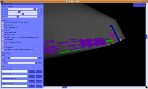
Museums are increasingly adopting open data policies, both for easy internal reuse of data sets and as a way of building community engagement online. While the opening up of data is a welcome development, too often key audiences see too little of this information through too small a keyhole. As linked and open data formats and Application Programming Interfaces become more common for cultural repositories, providing a sense of the scope and shape of museum collections is moving from a problem of data access to one of presentation.
This project will develop a set of visualizations appropriate for aggregate museum collection metadata, but with an eye to answering different questions than most museums currently address online. Focusing on the two dimensions most likely to be available in museum metadata, time and space, the visualizations will try to convey the sense of place and ascribed cultural value over time as represented in collections.
Visualizing public data about (global) cultural heritage can suggest how one culture sees another and lead to a more open discussion about how the story of public culture is being told.
> Find updated information on the wiki
New Political Interfaces (Nuevas Interfaces Políticas)
By Cristóbal Castilla, Héctor Sánchez-Pajares and José Hernández. Collaborators: Daniel González (design and programming), Roland Heuge (programming), Samara Tanak (design) y Miguel López (research and documentation).
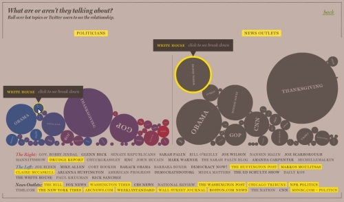
What themes are shared and not shared by politicians and the media? How significant are they for each of them? How are messages disseminated? Are there any dissemination patterns?
To answer these questions, we focused on Twitter as a social network and the USA as the political media axis. Thus, we can compare the messages and their conservative and more progressive contents with the media and study possible correlations.
> More information on the wiki and http://newpoliticalinterfaces.org/
Kultur-o-meter
By Atravesad*s por la cultur: Basurama.org (Pablo Rey), Traficantes de Sueños (traficantes.net), Mar M. Núñez (noez.org). Collaborators: Tila Cappelletto and Alma Orozco (basic graphics, XML samples)
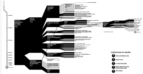
An analysis of the budgets of a set of emblematic cultural institutions in the city of Madrid, beginning with the City
Government. As a result of the first phase of this analysis, we have obtained this graph, which will serve as a basis for the future visualization tool.
Our goal is to expand the study in depth and breadth, include other city institutions, and manage to visualize these data in a way that citizens find easy and accessible. To do so, the group is open to new people interested in taking part in the research and the development of the tool.
> More information on the wiki y en http://kulturometer.org
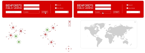
Surveillance Under Control
By Jonás Fernández Reviejo, Víctor Rodrigo Gudiel, and Miguel Valero Espada. Collaborators: Oriol Ocaña and Sandra Chávez (graphic design), Tom Schofield (programming in Processing), and Yeray Hernández (programming).
> Find updated information on the Wiki
The River Project (Proyecto Ríos)
By Asociación Territorios Vivos (ATV). Collaborators: Carles Gutiérrez. AS3 (design, database, implementation).
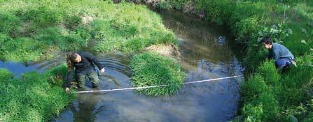
The visualization offers a map of the Comunidad de Madrid (Madrid Region) in which the original rivers are seen in the background. The river sections where groups of volunteers carry out inspections are shown with a dot, such that where the dots along a river meet (various sections that have been inspected), the river moves into the foreground, which “makes the river real”. At the same time, each of the dots provides information on the river’s degree of health, given that users can consult the main parameters obtained in the river inspection (pH, flow, the presence of flora and fauna, etc.).
An online form has also been created so that volunteers can add the results of their inspections. They are directly added to the application’s database. This operation can also be carried out via mobile telephone.
> More information on the Wiki and Proyecto Ríos
FLUflux
By Jihyun Kim and Andrés Colubri. Collaborators: Larissa Pschetz (programming).
FLUflux is a data visualization project showing significant correlations between global pandemics (SARS, Avian flu and influenza A), international flight travel, media representation of disease and online individual responses. The changes in the influx of people traveling between countries reflects historical events. FLUflux highlights these changes by focusing in the concept of "global disease".
> More information on the wiki and http://threeecologies.com/fluflux/
Invited project: In the Air
by Nerea Calvillo. Collaborators: Paolo Battino y Velentina Basotti (informational architecture), Raquel Osa, Martina Fernández Ramos y Guillermo San Miguel (contents), Martín Nadal (code), and Francisco Martín: technical assistant.
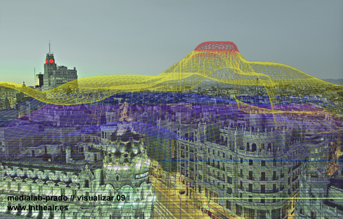
In the Air was developed in its first stage during the last last Visualizar edition (Visualizar'08: Database City), dedicated to data visualization applied to the city context. The project was developed with the collaboration of Guillermo Ramirez, Carlota Pascual, Greg J. Smith, Victor Viña, Raphaël de Staël, Paco González, Miguel Vidal, Susanna Tesconi, and Sandra Fernández.
The project aims to visualize the microscopic and invisible agents in Madrid’s air (gasses, particles, pollen, diseases, etc.) in order to match their behavior, their reaction and interaction with the rest of the city.
The following lines of work will be developed:
- Scientific tool. Incorporation of new data on the city and climate. Real Time data, historical data, etc.
- Social tool. Decision-making promotion by creating a game. Visualizing the action’s effects. Competence. Consequences in the city.
- Network of cities. Development of the application for its application in other cities. Comparative data, platform, local specifity.
- Production of new data. Development of sensors that produce independent data and incorporate it to the application. Simultaneity of divers data.
- Exterior visualization. Development of external visualization devices. Alternatives to “Diffused façade”.
> More information on the wiki and www.intheair.es
>More information about the projects on the workshop wiki
With the support of the Spanish Foundation for Science and Technology - Ministry of Science and Innovation (FECYT - Ministerio de Ciencia e Innovación)


Place:
Medialab Prado · Plaza de las Letras, C/ Alameda, 15 Madrid
Sessions of the activity
The activity is over